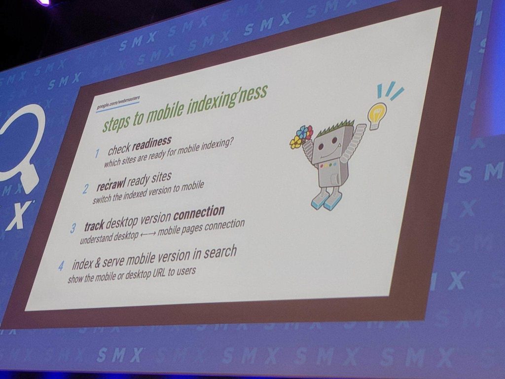
Mobile-first indexing is Google’s latest brainchild, which is something that was long overdue. It’s hard to find someone not carrying a smartphone on an average day, and they’ve become a vital tool for everyday business. A large majority of users now rely on their phones for personal services and rarely can anyone be bothered to research something on desktops. Mobile SEO has always been a key part of an effective SEO strategy, but based on the new update, it might appear that the first thing businesses need to consider is Mobile SEO. Of course, this can vary for different businesses, because of the pattern of searching. Mobile SEO is a lot likely to be relevant for restaurants and localised services, because users are likely to search for them on the go. The difference in convenience between a well-optimised restaurant website menu and a slow loading desktop site on a user’s phone can make all the difference to a customer looking to try a new menu. Similarly, this principle can be applied to any business that serves a local area by definition, such as doctors, mechanics and handymen just to name a few.
This is why Mobile SEO and Mobile-First Indexing is poised to be a disruptive update, because it will fundamentally change the old concept of ranking a website well on mobile based on its desktop equivalent’s SEO.
However it is important to note that in a recent press release Google expressly stated that a good quality desktop website will be valued better than a low quality mobile website. The takeaway from SEO Sydney, is that although mobile-first indexing is a game-changer, business owners have plenty of time to learn the rules of the game.
Mobile devices in perspective
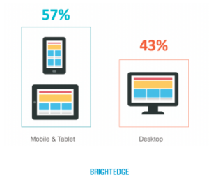
Over the past few years, mobile device usage has exploded with the average Australian owning and operating three connected devices including smartphones, tablets, laptops, wearables and consoles according to Statista. Moreover, it becomes unsurprising that even in 2015 – three years ago – Google officially confirmed that searches take place on mobile devices more than desktop computers in 10 countries including the USA and Japan. Now in 2017, a recent report by SEO and Content performance platform BrightEdge further emphasised this by highlighting that 57% of all online traffic is now on mobiles and tablets which translates to almost 6 out of every 10 people.
Whilst this revelation provides valuable insight into ways the imminent focus can be shifted onto mobile SEO strategy and further optimisation, it does not mean that the desktop computer is hurtling towards its end. Rather, it merely provides an additional opportunity for businesses to increase the reach among a different pool of potential customers through speed and website mobility optimisation.
Introduction to mobile-first index
So, what is mobile-first index?
At present, Google’s desktop-index is solely based on full-featured desktop websites by analysing the content, page speed, links and other elements to determine SERP’s. In turn, essentially the mobile-first index is an alternate method in which Google ranks search listings based on the mobile version only of a website’s content. During the rollout period, the two will co-exist as two separate indexes, but over time they may or may not combine. For more information, Search Engine Land provides a FAQ for further reading.
The reality of this is that for businesses to become more attractive to the mobile-first index, they need to simultaneously improve and maintain the functionality of both their desktop and mobile pages alike. The shift towards mobile-indexing is slow, and Google like any other business, just wants to make sure it is providing a good user experience. A mobile-first indexing algorithm forces businesses to get competitive and up their game, providing the customers with better services and convenience. Google is in a position to change the market by changing the strategy toward a cleaner User Experience on all platforms, mobile ones included. The idea is that the devices gaining the most traction in the market, like smartphones should always be prioritised over the ones that are fading into the background, like desktops. If the trend switches to voice-search tomorrow, then Google would be well within its rights to reward sites that are better optimised for voice searches. At the end of the day, user experience is Google’s endgame. Implementing the mobile-first index will help them do just that – it is then up to businesses to mobile optimise to achieve traction within the mobile only SERP’s.
How to prepare for changes in Mobile SEO
First and foremost, one of the most important things you can do to prepare for these changes is to make sure your website is streamlined and easy to navigate. If your website is not as mobile-friendly as it should be, the best place to start is:
- Responsive web design
- Content navigation and creation
Responsive web design
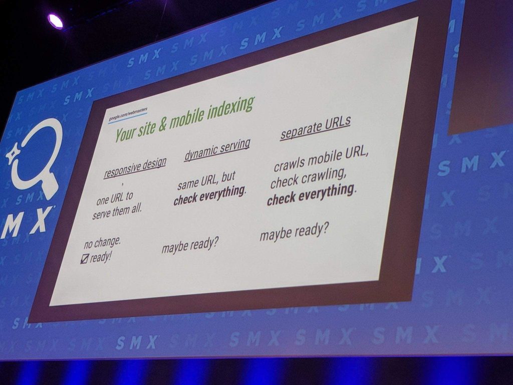
Responsive web design is crucial to the user experience – so if your website is already responsive you don’t need to change anything. If your mobile site is lacking in comparison to its desktop counterpart – don’t panic! In anticipation for its launch, with a little preparation you won’t need to worry about Google destroying your hard-earned organic rankings.
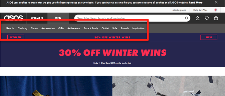
Dubbed Google’s recommended method, responsive web design means that when someone views your website on a mobile device, your website is able to respond and adapt to whatever size device that the user is viewing on and allows them to easily navigate through your content. For example, many popular online shopping websites like Asos have nailed this already because they rely heavily on guiding the consumer through the decision making process to maximise conversions. Asos’ desktop landing page offers extensive navigation through numerous categories because browsing the site on a desktop is often a more time-consuming and in-depth process. On the other hand, while the mobile version follows Asos’ common and consistent theme, it has been simplified to two call to action buttons; Men and Women. By removing the need for horizontal scrolling, offering large enough text to be legible without zooming in and providing click-friendly fingertip sized buttons and links, the site becomes tailored to the speed and convenience that users have come to expect on mobile devices.
On the other hand, author Suzanne Collins and her website has become the epitome of bad website design amongst the world of SEO. In addition to the obvious lack of an aesthetically pleasing design, the crux of its bad reputation is due to the fact that the website remains stagnant and unresponsive on mobile. To read or click on any links on this page, the viewer needs to continually pinch the screen till it becomes large enough to be legible. This will continue to rank poorly with the rollout of the mobile-first index because the Google-bot will recognise that the site is not mobile friendly and offers a bad user experience filled with constant zooming and dead-end links.
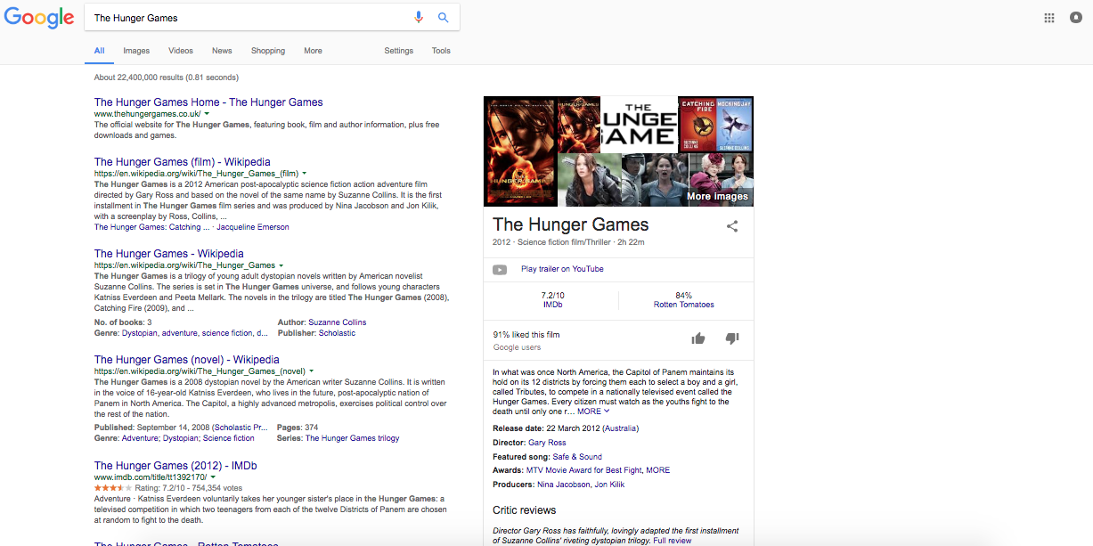
Despite being the creator of the popular fiction trilogy ‘The Hunger Games’, Suzanne Collin’s own website does not even appear on the first page of a desktop Google search of the keywords ‘The Hunger Games’. If the site does not appear on a desktop search, what chance does it have against the mobile-first index? From an SEO perspective, this is a detrimental mistake that can easily be fixed with some basic website design improvements. Check out SEO TV on tips to remember when redesigning your site for SEO.
Content navigation and creation
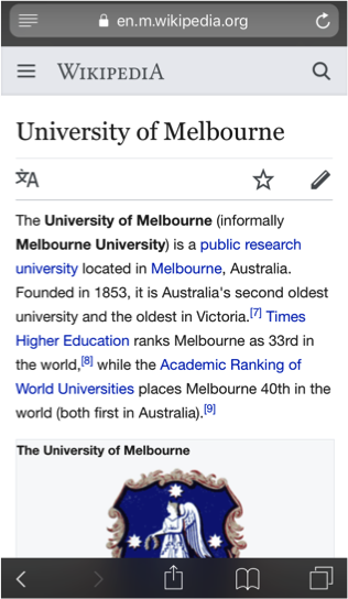
The content that is available on your desktop website, should also be readily available on your mobile site. This is because the mobile-first index will be analysing your mobile site as the primary source of content, regardless of your desktop site. But, the rules of engagement are totally different on mobile. While it’s a good idea to have comprehensive information on your website, on a mobile device no one wants to get stuck in a trap of endless scrolling with their thumb. The content needs to be short and sweet, where users can easily obtain the main points because it is easy to navigate, skim and digest. For example, Wikipedia – the website that everyone loves to hate (and hates to love), offers unprecedented access to content on pretty much anything you could ever imagine. Because their website design is responsive as mentioned above, they do not have to scale back information for the sake of mobile friendliness. The user is guided through the content starting with a brief information summary.
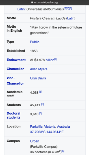
Let’s look at the University of Melbourne’s Wikipedia more closely; the information summary is presented in a few short sentences, followed by a table of key information. This makes it easier for on-the-go mobile users because it conveys a large amount of information quickly and helps users determine if they want to read more in-depth.
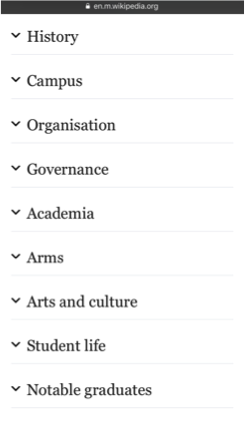
Want to read more? Keep scrolling and there is an expandable section that allows users to read in depth if they choose. In a list format there are various headings including history, campus and governance, the information simultaneously keeps the page shorter whilst enabling easy access to the relevant information. Whilst these are the main features that Wikipedia utilises, there are other useful mobile optimisation techniques including but not limited to tabs, table of contents and filters that should be considered when designing content for mobile SEO and the mobile-first index. You can read more about these over at Search Engine Land here.
Not only is the way you present content on your website imperative to the user experience, delivering the right content marketing strategy is also important for mobile SEO. In this sense, organisations need to continually focus on delivering relevant and engaging content by starting with the target audience and diving into deeper understanding of the brands expertise to create value. Moz’s blog uses an example of a financial education institution implementing a content strategy that leverages their existing network of current students to produce content with a more conversational, easy to understand and engaging tone. They realised that their main competitors were creating very factual, dry content that no one really wanted to read because it was over-complicated and boring, therefore they took a more customer-centric approach by supporting them with authentic content that they would actually want to read. Who’d have thought? By realising the intersection between your expertise and your audience’s pain point, you have the ability to support your prospective customer on their journey by providing them with relevant content that will not only increase organic traffic on your site but convert them too.
Munich March Update:
As of two weeks ago, Google has started moving websites to the mobile first index. However unlike algorithm updates, Google has announced that the website owners will be notified through the search console when this happens. Quite a few websites have been moved to the new index, but nobody has been notified yet despite the announcement, so presumable the notification part is still being worked out at Google.
If you’re not sure if your website has been moved to the mobile index, there are some key indicators that may help you spot it. Look for an increase in activity from the mobile version of Googlebot, coupled with a noticeable dip in desktop traffic. If this correlates together, then it is likely that your site is now a part of the mobile-first index.
Mueller at Google says that a nobody has noticed that a significant number of sites have been moved to the new index, which might also mean that in some cases, the loss of desktop traffic is negligible. It has also been announced that a new annotation will be added to the Search Console reports, which will give an indication of when the site was moved to the mobile-first index. This is so that business and site owners are able to compare the traffic, before and after the switch.
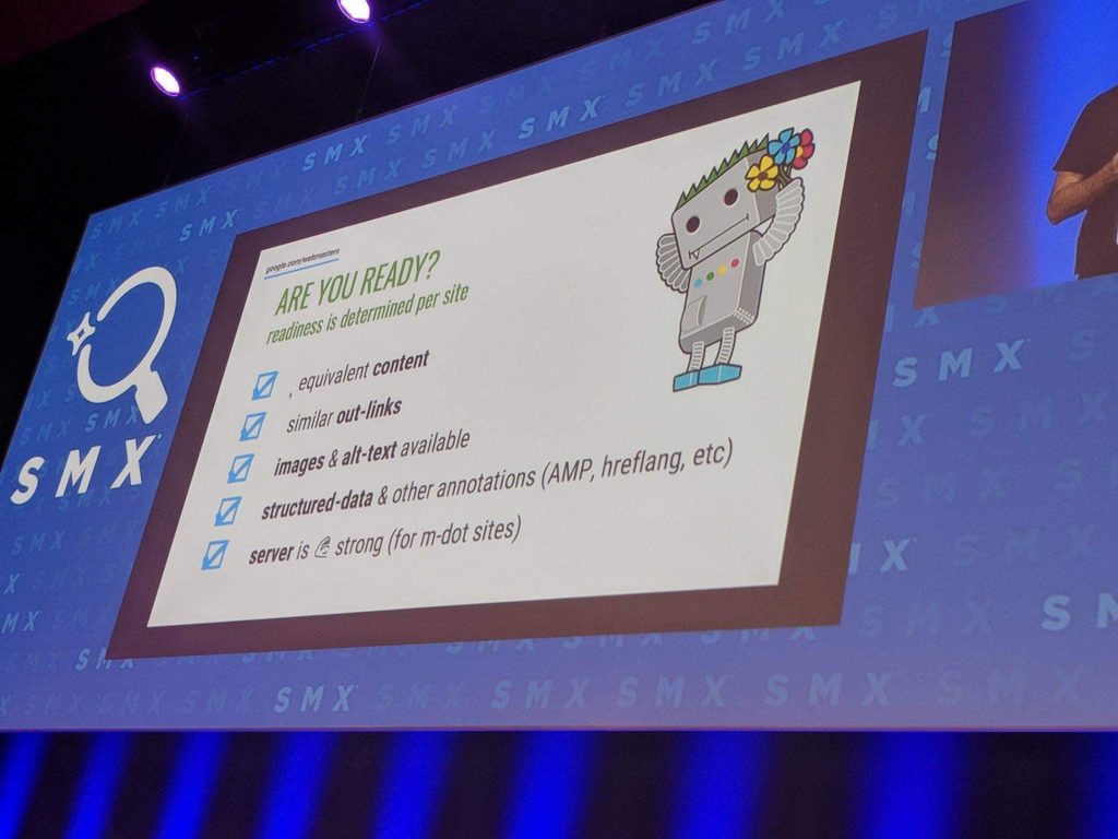
The recent announcement also covered the fact that Google is moving individual sites that it feels are ‘ready’ for this transition. The criteria for determining this readiness are based on the responsiveness and optimisation of the website, with respect to mobile searches. A website that has invested heavily in Mobile SEO therefore, is likely to make a seamless transition without ever noticing a drop in traffic at all. It was emphasised in the announcements that markups on mobiles are as important as they are on desktop versions.
Mobile SEO: The takeaway
Let’s face it, in 2017 there is so much information and technology readily available it is becoming almost inexcusable to have an unresponsive, difficult to navigate and overall poorly designed website. There are tools, techniques and search engine optimisation industry professionals ready and waiting to optimise both your desktop and mobile websites regardless of the arrival of Google’s mobile-first index.
So if you haven’t already, these are a few ways to make a start and mobile optimise your website to achieve some great results in 2018. Check out SEO Sydney – the experts in all things SEO that can help you with your website today!

